R - DicePlot (Legacy)
Important
R users should use the ggdiceplot package instead!
If you are working in R, please consider using the ggdiceplot package instead. ggdiceplot is a fully ggplot2-native implementation that offers more flexibility, better integration with the ggplot2 ecosystem, and additional features. See the ggdiceplot: The Recommended R Implementation chapter for modern R usage.
DicePlot remains available on CRAN for compatibility with existing projects, but is no longer the primary R interface.
Note
This repository is maintained for backwards compatibility
The DicePlot package allows you to create visualizations (dice plots) for datasets with more than two categorical variables and additional continuous variables. This tool is particularly useful for exploring complex categorical data and their relationships with continuous variables.
Requirements and installation
Important
Before installing DicePlot, consider ggdiceplot!
For new R projects, we strongly recommend using ggdiceplot
instead. ggdiceplot is the preferred R interface with full ggplot2 integration.
Install it with: devtools::install_github("maflot/ggdiceplot")
The instructions below are for the legacy DicePlot package, which remains available on CRAN if needed for compatibility with existing code.
1. Install R
Ensure that you have R installed on your system. You can download it from The Comprehensive R Archive Network (CRAN). Or use conda:
conda create -n diceplot -c conda-forge r-base -y
conda activate diceplot
2. Install Required Packages
The DicePlot package depends on several other R packages. Install them by running:
install.packages(c(
    "devtools",
    "dplyr",
    "ggplot2",
    "tidyr",
    "data.table",
    "ggdendro"
))
3. Install DicePlot
You have three options for installing the DicePlot package:
Direct installation from CRAN (Recommended):
install.packages("diceplot")
Install from GitHub:
# Install devtools if you haven't already
install.packages("devtools")
# Install DicePlot from GitHub
devtools::install_github("maflot/DicePlot/diceplot")
Install from Local Files:
install.packages("$path on your local machine$/DicePlot/diceplot", repos = NULL, type = "source")
1. Load the Package
After installation, load the DicePlot package into your R session:
library(diceplot)
Diceplot: Tutorial
Tip
For a fully ggplot2-compatible workflow, use ggdiceplot!
The examples below use the legacy DicePlot package. For modern R development, we recommend using ggdiceplot which provides the same functionality with native ggplot2 integration. See ggdiceplot: The Recommended R Implementation for details.
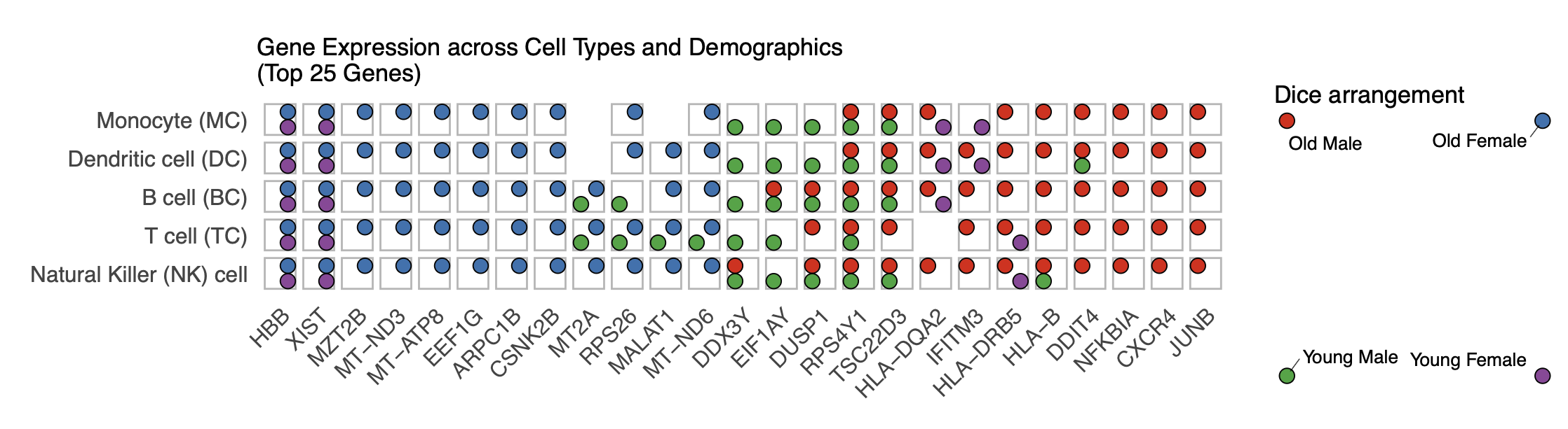
Real-World Example
Here is a real-world example using data from Huang et al. (2021) showing gene expression patterns across different immune cell types and demographic groups.
# Load necessary libraries
library(readxl)
library(dplyr)
library(tidyr)
library(stringr)
library(writexl)
library(RColorBrewer)
library(UpSetR)
library(ggplot2)
library(diceplot)

# Set your file path
file_path <- "data/pnas.2023216118.sd05.xlsx"

# Function to create the properly formatted CSV
process_excel_to_csv <- function(file_path) {
  # Read Excel file with detailed options
  raw_data <- read_excel(file_path, col_names = FALSE, na = "", trim_ws = TRUE)

  # Extract cell types from row 2
  cell_types_row <- raw_data[2,]

  # Extract demographic info from row 3
  demo_row <- raw_data[3,]

  # Create a list to store all transformed data
  all_data <- list()

  # Define cell type mapping
  cell_type_map <- c(
    "NK" = "Natural Killer (NK) cell",
    "TC" = "T cell (TC)",
    "BC" = "B cell (BC)",
    "DC" = "Dendritic cell (DC)",
    "MC" = "Monocyte (MC)"
  )

  # Process each cell type column
  cell_type_columns <- c()
  for (i in 1:ncol(raw_data)) {
    if (!is.na(cell_types_row[[i]]) && cell_types_row[[i]] != "") {
      cell_type_columns <- c(cell_type_columns, i)
    }
  }

  # Process each cell type column and its associated demographic columns
  for (col_idx in cell_type_columns) {
    cell_type <- cell_types_row[[col_idx]]
    cell_type_full <- cell_type_map[cell_type]

    for (offset in 0:3) {
      demo_col <- col_idx + offset

      if (demo_col <= ncol(raw_data) && !is.na(demo_row[[demo_col]]) && demo_row[[demo_col]] != "") {
        demo_info <- demo_row[[demo_col]]

        age <- case_when(
          substr(demo_info, 4, 4) == "O" ~ "old",
          substr(demo_info, 4, 4) == "Y" ~ "young",
          TRUE ~ NA_character_
        )

        sex <- case_when(
          substr(demo_info, 5, 5) == "M" ~ "male",
          substr(demo_info, 5, 5) == "F" ~ "female",
          TRUE ~ NA_character_
        )

        for (row_idx in 4:nrow(raw_data)) {
          gene <- raw_data[row_idx, demo_col][[1]]

          if (is.na(gene) || gene == "") {
            next
          }

          gene_row <- data.frame(
            id = paste0(cell_type, "_", demo_info, "_", gene),
            gene = gene,
            cell_type_code = cell_type,
            cell_type = cell_type_full,
            age_code = substr(demo_info, 4, 4),
            age = age,
            sex_code = substr(demo_info, 5, 5),
            sex = sex,
            demo_code = demo_info
          )

          all_data[[length(all_data) + 1]] <- gene_row
        }
      }
    }
  }

  return(bind_rows(all_data))
}

# Process the data
processed_data <- process_excel_to_csv(file_path)

# Create a demographic combination column
processed_data <- processed_data %>%
  mutate(demo_combination = case_when(
    age == "old" & sex == "male" ~ "Old Male",
    age == "old" & sex == "female" ~ "Old Female",
    age == "young" & sex == "male" ~ "Young Male",
    age == "young" & sex == "female" ~ "Young Female",
    TRUE ~ paste(age, sex)
  ))

# Order the demographic combinations factor
processed_data$demo_combination <- factor(
  processed_data$demo_combination,
  levels = c("Old Male", "Old Female", "Young Male", "Young Female")
)

# Order cell types
processed_data$cell_type <- factor(
  processed_data$cell_type,
  levels = c(
    "Natural Killer (NK) cell",
    "T cell (TC)",
    "B cell (BC)",
    "Dendritic cell (DC)",
    "Monocyte (MC)"
  )
)

# Create summary table with gene counts
gene_counts <- processed_data %>%
  group_by(gene, cell_type, demo_combination) %>%
  summarize(tmp_count = n(), .groups = "drop")

# Define colors for demographic combinations
demo_colors <- c(
  "Old Male" = "#E41A1C",     # Red
  "Old Female" = "#377EB8",   # Blue
  "Young Male" = "#4DAF4A",   # Green
  "Young Female" = "#984EA3"  # Purple
)

# Get top 25 most frequent genes
top_25_genes <- processed_data %>%
  count(gene) %>%
  arrange(desc(n)) %>%
  head(25) %>%
  pull(gene)

# Filter gene_counts to include only top 25 genes
filtered_gene_counts <- gene_counts %>%
  filter(gene %in% top_25_genes)

# Add default group column
filtered_gene_counts$default = ""

# Create the diceplot
p_dice_filtered <- dice_plot(
  data = filtered_gene_counts,
  x = "gene",                    # x-axis: genes
  y = "cell_type",               # y-axis: cell types
  z = "demo_combination",        # z parameter: demographic combinations
  cluster_by_column = T,
  cluster_by_row = F,
  title = "Gene Expression across Cell Types and Demographics\n(Top 25 Genes)",
  z_colors = demo_colors,        # Use the proper color palette
  max_dot_size = 6,
  min_dot_size = 3,
  legend_width = 0.2,
  legend_height = 0.25,
  show_legend = T
)

# Display the diceplot
print(p_dice_filtered)
Artificial example
Here is a simple example demonstrating how to use the DicePlot v0.1.2 package. For additional examples, please refer to the tests/ folder.
# Load necessary libraries
library(diceplot)
library(tidyr)
library(data.table)
library(ggplot2)
library(dplyr)
library(tibble)
library(grid)
library(cowplot)
library(RColorBrewer)

# Define common variables
cell_types <- c("Neuron", "Astrocyte", "Microglia", "Oligodendrocyte", "Endothelial")
pathways <- c(
   "Apoptosis", "Inflammation", "Metabolism", "Signal Transduction", "Synaptic Transmission",
   "Cell Cycle", "DNA Repair", "Protein Synthesis", "Lipid Metabolism", "Neurotransmitter Release",
   "Oxidative Stress", "Energy Production", "Calcium Signaling", "Synaptic Plasticity", "Immune Response"
)

# Assign groups to pathways
pathway_groups <- data.frame(
   Pathway = pathways,
   Group = c(
      "Linked", "UnLinked", "Other", "Linked", "UnLinked",
      "UnLinked", "Other", "Other", "Other", "Linked",
      "Other", "Other", "Linked", "UnLinked", "Other"
   ),
   stringsAsFactors = FALSE
)

pathology_variables <- c("AD", "Cancer", "Flu", "ADHD", "Age", "Weight")

# Assign colors to pathology variables
n_colors <- length(pathology_variables)
colors <- brewer.pal(n = n_colors, name = "Set1")
z_colors <- setNames(colors, pathology_variables)

# Create dummy data
set.seed(123)
data <- expand.grid(CellType = cell_types, Pathway = pathways, stringsAsFactors = FALSE)

data <- data %>%
   rowwise() %>%
   mutate(
      PathologyVariable = list(sample(pathology_variables, size = sample(1:length(pathology_variables), 1)))
   ) %>%
   unnest(cols = c(PathologyVariable))

# Merge the group assignments into the data
data <- data %>%
   left_join(pathway_groups, by = "Pathway")

# Use the dice_plot function with new parameter names
p = dice_plot(
   data = data,
   x = "CellType",
   y = "Pathway",
   z = "PathologyVariable",
   group = "Group",
   group_alpha = 0.6,
   title = "Dice Plot with 6 Pathology Variables",
   z_colors = z_colors,
   custom_theme = theme_minimal(),
   min_dot_size = 2,
   max_dot_size = 4
)

print(p)
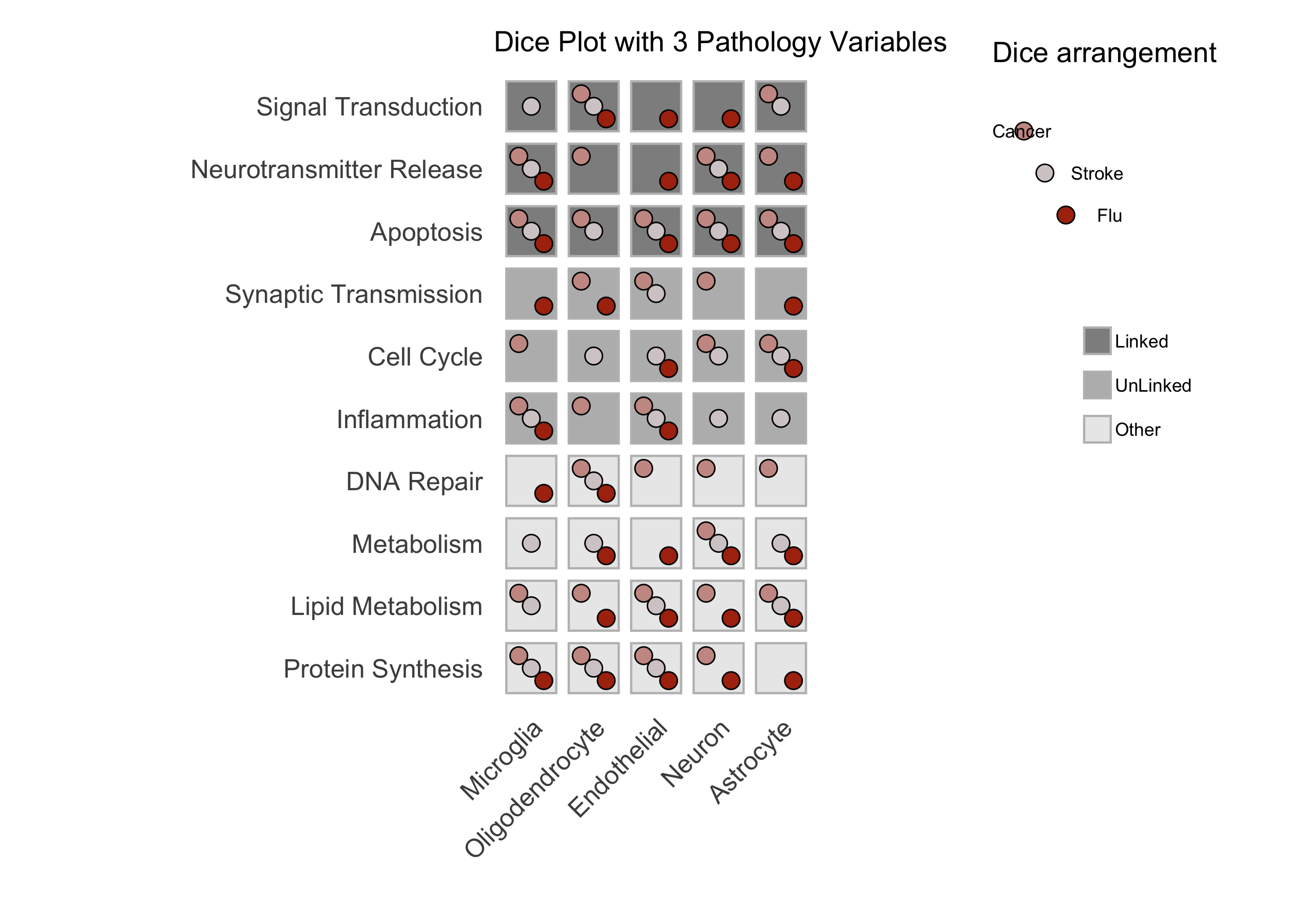
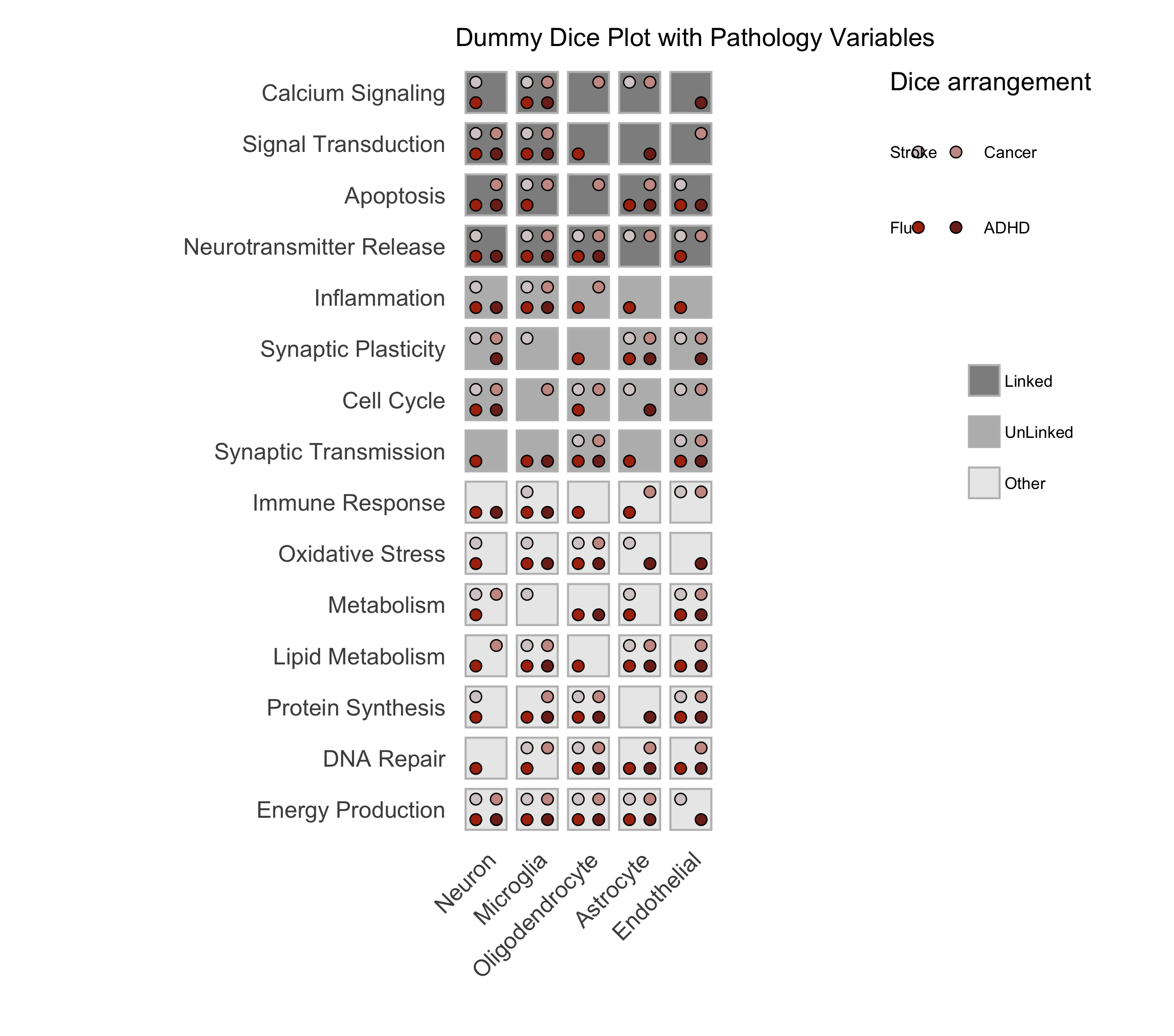
Figure: A sample dice plot generated using the ``DicePlot`` package.
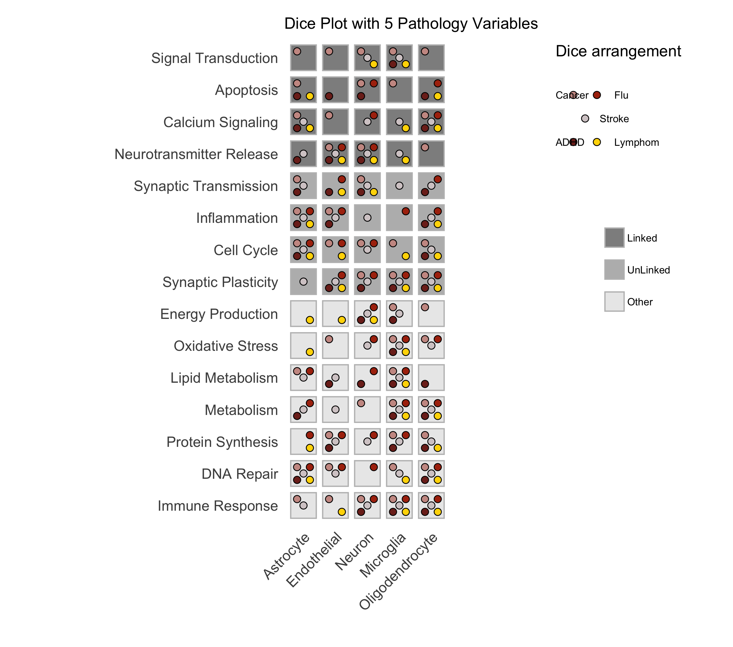
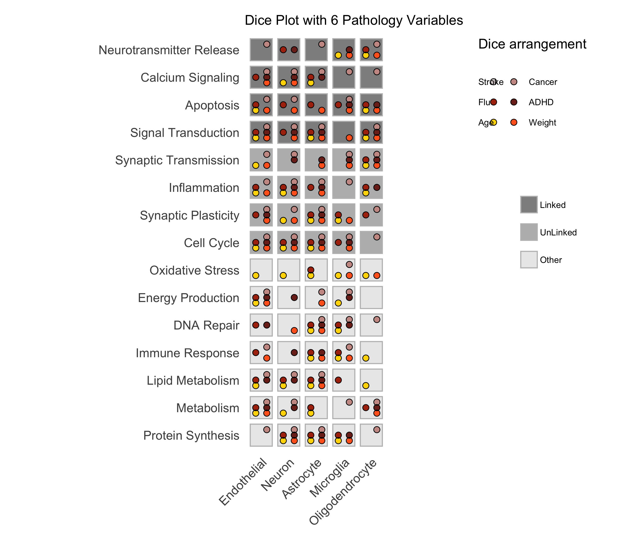
Figure: A sample dice plots
Domino Plot Tutorial
Tip
ggdiceplot provides a more flexible domino plot implementation!
While the examples below demonstrate the legacy DicePlot domino_plot function,
the ggdiceplot package offers domino plots with full ggplot2 customization.
See the ggdiceplot: The Recommended R Implementation chapter for the modern approach using geom_dice().
Introduction to Domino Plots
A Domino Plot is a specialized visualization from the DicePlot package that allows you to display differential expression data across multiple categorical variables. It’s particularly useful for visualizing how gene expression changes across different cell types, conditions, and contrasts.
The plot uses colors to represent up/down-regulation and size to represent statistical significance. This example uses data from the ZEBRA database, a hierarchically integrated gene expression atlas of the murine and human brain at single-cell resolution.
Prerequisites
Before starting, ensure you have the following packages installed:
install.packages(c("dplyr", "tidyr", "ggplot2", "diceplot"))
Dataset Overview
For this tutorial, we’ll use a dataset derived from human cortex samples that contains differential expression analysis results comparing gene expression between sexes across various neurological conditions. The dataset includes:
gene: Gene symbols
cell_type: Different cell types in the brain
contrast: Different disease conditions compared to control (e.g., “MS-CT” compares Multiple Sclerosis to Control)
sex: The contrast variable (male vs female)
logFC: Log fold change values
PValue and FDR: Statistical significance measures
Step 1: Load Required Libraries
library(dplyr)
library(tidyr)
library(ggplot2)
library(diceplot)
Step 2: Load and Prepare the Data
# Load dataset
zebra.df = read.csv(file = "data/ZEBRA_sex_degs_set.csv")

genes = c("SPP1","APOE","SERPINA1","PINK1","ANGPT1","ANGPT2","APP","CLU","ABCA7")
zebra.df <- zebra.df %>% filter(gene %in% genes) %>%
  filter(contrast %in% c("MS-CT","AD-CT","ASD-CT","FTD-CT","HD-CT")) %>%
  mutate(cell_type = factor(cell_type, levels = sort(unique(cell_type)))) %>%
  filter(PValue < 0.05)
Step 3: Create a Basic Domino Plot
p_basic <- domino_plot(
  data = zebra.df,      # Input data
  gene_list = genes,    # List of genes to include
  var_id = "contrast",  # Variable that identifies different conditions
  x = "gene",           # Variable for x-axis
  y = "cell_type",      # Variable for y-axis
  contrast = "sex",     # Contrast variable (e.g., male vs female)
  log_fc = "logFC",     # Column name for log fold change
  p_val = "FDR"         # Column name for p-values
)

# Display the plot
print(p_basic)
Step 4: Create a Customized Domino Plot
p_advanced <- domino_plot(
  data = zebra.df,
  gene_list = genes,
  var_id = "contrast",
  x = "gene",
  y = "cell_type",
  contrast = "sex",
  log_fc = "logFC",
  p_val = "FDR",
  min_dot_size = 1,     # Minimum dot size for least significant results
  max_dot_size = 3,     # Maximum dot size for most significant results
  logfc_limits = c(min(zebra.df$logFC)-1, max(zebra.df$logFC)-1)  # Custom logFC color scale limits
)

# Display the plot
print(p_advanced$domino_plot)
Step 5: Further Customizing the Plot
p_custom <- p_advanced$domino_plot +
  theme_minimal() +
  theme(
    axis.text.x = element_text(angle = 45, hjust = 1),
    plot.title = element_text(hjust = 0.5, size = 14),
    legend.position = "bottom"
  ) +
  labs(title = "Differential Expression Across Cell Types and Conditions")

# Display the customized plot
print(p_custom)

# Save the plot
ggsave("domino_plot_example.png", p_custom, width = 10, height = 8, dpi = 300)
Step 6: Creating a Faceted Domino Plot
p_faceted <- domino_plot(
  data = zebra.df,
  gene_list = genes,
  var_id = "contrast",
  x = "gene",
  y = "cell_type",
  contrast = "sex",
  log_fc = "logFC",
  p_val = "FDR",
  min_dot_size = 1,
  max_dot_size = 3
)$domino_plot +
  facet_wrap(~contrast, scales = "free_y") +
  theme(
    strip.background = element_rect(fill = "lightgray"),
    strip.text = element_text(face = "bold")
  )

# Display the faceted plot
print(p_faceted)

# Save the faceted plot
ggsave("domino_plot_faceted.png", p_faceted, width = 14, height = 10, dpi = 300)
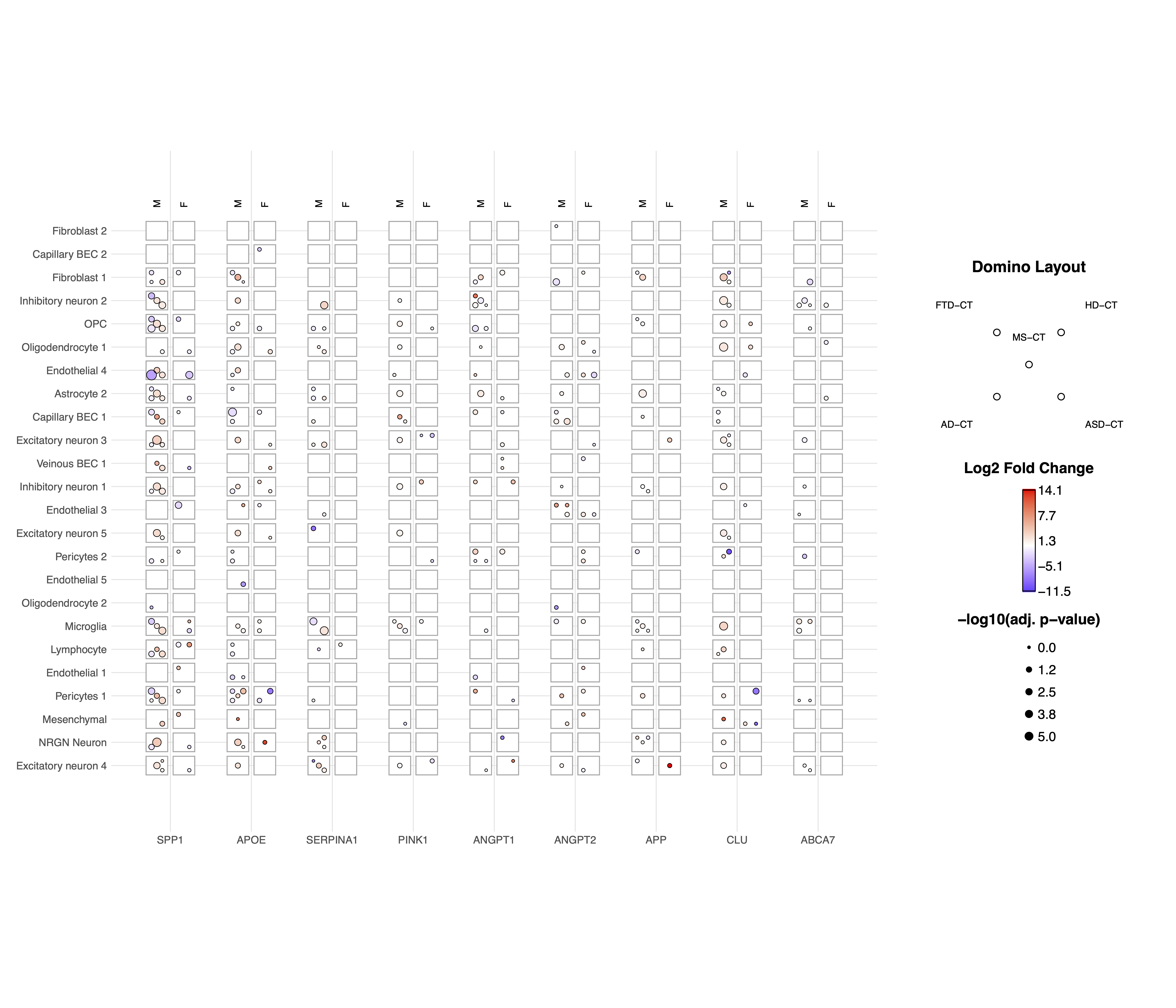
Understanding the Domino Plot Output
In a domino plot:
Color: Represents the direction and magnitude of change - Red typically indicates upregulation (positive logFC) - Blue typically indicates downregulation (negative logFC) - The intensity of color represents the magnitude of change
Size: Represents statistical significance - Larger dots indicate more statistically significant results (smaller p-values) - Smaller dots indicate less statistically significant results (larger p-values)
Position: Shows the combination of categorical variables - x-axis: Typically genes - y-axis: Typically cell types - Facets (if used): Can represent different conditions or contrasts
geom_dice_sf Tutorial
Tip
Spatial visualization with ggdiceplot
The geom_dice_sf functionality shown below is also available in ggdiceplot
with enhanced ggplot2 integration. For new projects, consider using
ggdiceplot for spatial dice plots.
Prerequisites
This tutorial has prerequisites which are not defaults in the diceplot package itself. Before proceeding, install the required R packages:
install.packages(c("sf", "ggplot2", "diceplot", "dplyr", "cowplot", "rnaturalearth"))
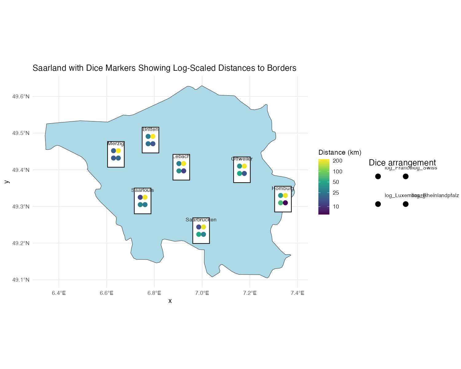
Dataset Overview
We use a dataset containing city locations in Saarland, along with their log-transformed distances to France, Switzerland, Luxembourg, and Rheinland-Pfalz.
name: City name
lon/lat: Geographical coordinates
dice: Number of dice dots (fixed at 4)
log_France, log_Swiss, log_Luxembourg, log_Rheinlandpfalz: Log-transformed distances to respective regions
Step 1: Load Required Libraries
library(sf)
library(ggplot2)
library(diceplot)
library(dplyr)
library(cowplot)
library(rnaturalearth)
Step 2: Load and Prepare the Data
# Define custom dice face positions
var_positions <- data.frame(
  x_offset = c(-0.3, 0.3, -0.3, 0.3),
  y_offset = c(0.3, 0.3, -0.3, -0.3),
  var = c("log_France", "log_Swiss", "log_Luxembourg", "log_Rheinlandpfalz")
)

# Load Germany state boundaries
germany_states <- ne_states(country = "Germany", returnclass = "sf")
saarland <- germany_states[germany_states$name == "Saarland", ]

# Define city locations and distances
cities <- data.frame(
  name = c("Saarbrücken", "Saarlouis", "Homburg", "Britten", "Merzig", "Lebach", "Ottweiler"),
  dice = 4,
  lon = c(6.996, 6.751, 7.339, 6.784, 6.639, 6.913, 7.167),
  lat = c(49.234, 49.315, 49.320, 49.481, 49.442, 49.407, 49.400),
  France = c(14, 12, 38, 27, 18, 27, 36),
  Swiss = c(190, 204, 195, 221, 220, 210, 206),
  Luxembourg = c(51, 31, 67, 23, 17, 35, 52),
  Rheinlandpfalz = c(29, 27, 6, 16, 20, 12, 16)
)

# Convert to spatial object
cities_sf <- st_as_sf(cities, coords = c("lon", "lat"), crs = 4326)
cities_sf$log_France <- log(cities_sf$France)
cities_sf$log_Swiss <- log(cities_sf$Swiss)
cities_sf$log_Luxembourg <- log(cities_sf$Luxembourg)
cities_sf$log_Rheinlandpfalz <- log(cities_sf$Rheinlandpfalz)
Step 3: Create a Custom Legend Function
create_custom_legends_for_map <- function(var_positions, dot_size, legend_text_size = 9) {
  legend_data <- var_positions %>% mutate(x = x_offset + 1, y = y_offset + 1)
  ggplot() +
    geom_point(data = legend_data, aes(x = x, y = y), size = dot_size, color = "black") +
    geom_point(data = legend_data, aes(x = x, y = y), size = dot_size + 0.5, shape = 1, color = "black") +
    coord_fixed(ratio = 1, xlim = c(0.5, 2.5), ylim = c(0.5, 1.5), expand = FALSE) +
    geom_text(
      data = legend_data,
      aes(
        x = ifelse(x > 0, x + 0.15, x - 0.15),
        y = ifelse(y > 0, y + 0.15, y - 0.15),
        label = var,
        hjust = ifelse(x < 0, 1, 0),
        vjust = ifelse(y > 0, 0, 1)
      ),
      size = legend_text_size / 3, color = "black"
    ) +
    ggtitle("Dice arrangement") +
    theme_void()
}
Step 4: Create a map with geom_dice_sf
# Generate legend plot
legend_plot <- create_custom_legends_for_map(var_positions, dot_size = 3)

# Generate main dice plot
main_plot <- ggplot() +
  geom_sf(data = saarland, fill = "lightblue", color = "black") +
  geom_dice_sf(
    sf_data = cities_sf,
    dice_value_col = "dice",
    face_color = c("log_France", "log_Swiss", "log_Luxembourg", "log_Rheinlandpfalz"),
    dice_size = 0.5,
    dot_size = 3
  ) +
  geom_text(
    data = cities_sf,
    mapping = aes(x = st_coordinates(cities_sf)[,1],
                  y = st_coordinates(cities_sf)[,2],
                  label = name),
    nudge_y = 0.03, size = 3
  ) +
  ggtitle("Saarland with Dice Markers Showing Log-Scaled Distances to Borders") +
  theme_minimal()

# Combine main plot and legend
final_plot <- plot_grid(main_plot, legend_plot, ncol = 2, rel_widths = c(4, 1))

# Display the final plot
final_plot
References
[1] Flotho, M., Flotho, P., Keller, A. (2024). Diceplot: A package for high dimensional categorical data visualization. arXiv preprint. https://doi.org/10.48550/arXiv.2410.23897
[2] Flotho, M., Amand, J., Hirsch, P., Grandke, F., Wyss-Coray, T., Keller, A., Kern, F. (2023). ZEBRA: a hierarchically integrated gene expression atlas of the murine and human brain at single-cell resolution. Nucleic Acids Research, 52(D1), D1089-D1096. https://doi.org/10.1093/nar/gkad990
[3] Huang, Z., Chen, B., Liu, X., Li, H., Xie, L., Gao, Y., Duan, R., Li, Z., Zhang, J., Zheng, Y., et al. (2021). Effects of sex and aging on the immune cell landscape as assessed by single-cell transcriptomic analysis. Proceedings of the National Academy of Sciences, 118(33), e2023216118. https://doi.org/10.1073/pnas.2023216118